
Skin Feedback
Forum page
76,461
pages on
this wiki
this wiki
| Forums: Index > Talk to the Admins > Skin Feedback |
|
THIS FORUM IS ABOUT THE RECENT UPDATE TO THE COLORS/LOGO/ART. WE
CANNOT
DO
ANYTHING
ABOUT THE LAYOUT BEING FIXED WIDTH. THAT FIGHT WAS LONG DEAD LAST FALL.
PLEASE
FOR THE LOVE OF WHAT EVER DEITY YOU SACRIFICE YOUR LOOT TO, DONT KEEP BRINGING IT UP.
Please put your comments/feedback/suggestions etc about the skin on this page (rather then Uber's talk page :P ).
-
The blue background is too pastel, IMO. Works for Easter a bit, but for normal use it's rather light. DoV has more of a darker icy feel, I'd say. Of course, this does nothing to solve the true problem unfortunately... fixed with skin is still a fail on wikia's part. I appreciate your trying to make it better Uberfuzzy, but can't you get it through to someone in the wikia hierarchy that a fixed width is 20 years out of date? --
lordebon
16:24, April 22, 2011 (UTC)
-
I'll look at tuning it to a darker blue, also something more "ice" feeling. Also, lets try not to make this a discussion about the Wikia layout please? Theres nothing we can do about it. --
Uberfuzzy
16:38, April 22, 2011 (UTC)
- For the record I really liked the idea of trying to make the space more visually appealing, my comment above wasn't meant to be an attack at you (I know that wasn't your decision). As for it being a lost cause... I refuse to believe any cause is lost. But that's neither here nor there... in the meantime while folks do have to use this skin (especially the "un-logged-in masses") the idea of filling that big empty (especially on large monitors) is a good one. I think it was just the color more than anything that was off. -- lordebon 13:09, April 28, 2011 (UTC)
-
I'll look at tuning it to a darker blue, also something more "ice" feeling. Also, lets try not to make this a discussion about the Wikia layout please? Theres nothing we can do about it. --
Uberfuzzy
16:38, April 22, 2011 (UTC)
- I'd go for a textured tiling background for more visual interest myself. And since the art you guys have tracked down is, as you suggested, kind of sad, I'm going to recommend asking some of your 3-D artists using Poser and DAZ-3D to maybe present some concept art of (in)famous EQ2 characters -- I am one such artist , and the "Fan Art" section of the EQ2 forums plus the EQ2 artists at dA have several others who may even be EQ2i contributors. I have a 1920 x 1080 monitor, and I have a huge sea of baby blue in the middle of which a narrow text band floats. Don't do this, please. I'd suggest a layout where the left and right panels are ONLY as wide as the art, and the central pane is free to expand to the remaining screenwidth. I'm staying with the old format, myself. It's clean, clear, and easy to read. But I'll keep checking as improvements continue. -- Sigrdrifa 17:07, April 27, 2011 (UTC)
- Ok, I'll look at those art links this week end. Again, we cant change the layout, or fixed width. -- Uberfuzzy 17:13, April 27, 2011 (UTC)
-
- There are ways (at the user-level, since the wikia TOS does not allow it to be done at the wiki level) to make the article content full screen. It basically involves adding a few lines of code to a certainly named page (or a single line, if you include it from somewhere else). That's what I currently do; I used to use Monobook but it lacks support for some things so I've just been working on making the Wikia/Oasis skin workable. There's still a few visual glitches but the main issue (the fixed width) is solvable. -- lordebon 13:09, April 28, 2011 (UTC)
-
-
- I have a good seamless ice tile for you to look at. -- Sigrdrifa 13:50, April 28, 2011 (UTC)
-
-
-
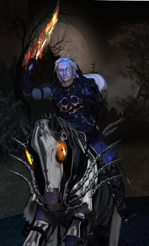
- I also threw together a quick proof-of-concept image of Lucan d'Lere for you. Antonia Bayle will be even easier. Since these are being created in DAZ or Poser, we can completely control dimensions, lighting, color, and so forth. -- Sigrdrifa 00:13, April 29, 2011 (UTC)
-
